
The polka dot revival: What it means for the way we decorate family homes
At some point over the last few months, you probably started noticing dots everywhere. On a cushion in a friend's living room. Scattered across a vanity set at a homewares store. Circling back, quietly, through cookware, ceramics, cushion covers and now — increasingly — bedding.
It's easy to write this off as another fast-moving decor moment, the kind that fills a Pinterest board for a season and disappears the next. But polka dots are proving to be a little more interesting than that. They're not arriving out of nowhere. They're part of a larger shift in how people want their homes to feel — and understanding why makes it a lot easier to use the print well, rather than just buying into it.
This is that explanation. Not a list of products to add to cart, but a proper look at where this trend came from, what it's really telling us about the way families are decorating right now, and how to bring it into a home in a way that still makes sense next year.
Why Polka Dots Are Having a Moment
Every returning trend has a reason, and this one has a few, layered on top of each other.
The most obvious is fashion. Polka dots moved through the SS26 runway shows in a noticeably grown-up form — tailored coats, tonal skirts, high-contrast dresses — a far cry from the primary-colour party dress version most of us grew up with. Interiors tend to follow fashion by six to twelve months, and that's exactly what's happening now. Homewares editors have been tracking the shift from runway to living room throughout the first half of the year, watching the print turn up in tableware, lighting and vanity styling before it reached anything as considered as a rug.
The second reason runs deeper. Pinterest's most recent trend forecast — built from billions of real search queries rather than guesswork — points to something they're calling trend fatigue. After a long run of quiet luxury, curated minimalism and "old money" restraint, a lot of people are simply tired of decorating to impress. The forecast describes a shift toward comfort, personal expression and a bit of nostalgia over status signalling. Polka dots fit that mood exactly. They're playful without being loud, familiar without being try-hard — a print most of us have a soft, slightly nostalgic association with, whether that's a childhood dress or a favourite tea set.
Then there's the colour story sitting underneath it. Chocolate brown has become one of the defining tones of the year, showing up across cushions, furniture and paint the same way beige once did — grounding, warm, easy to live with. Polka dots are turning up constantly paired with it: a cream base, a chocolate-toned dot, nothing else competing for attention. It's a pairing that reads as considered rather than decorative, which is a large part of why the trend feels more sophisticated than the polka dots of a decade ago.
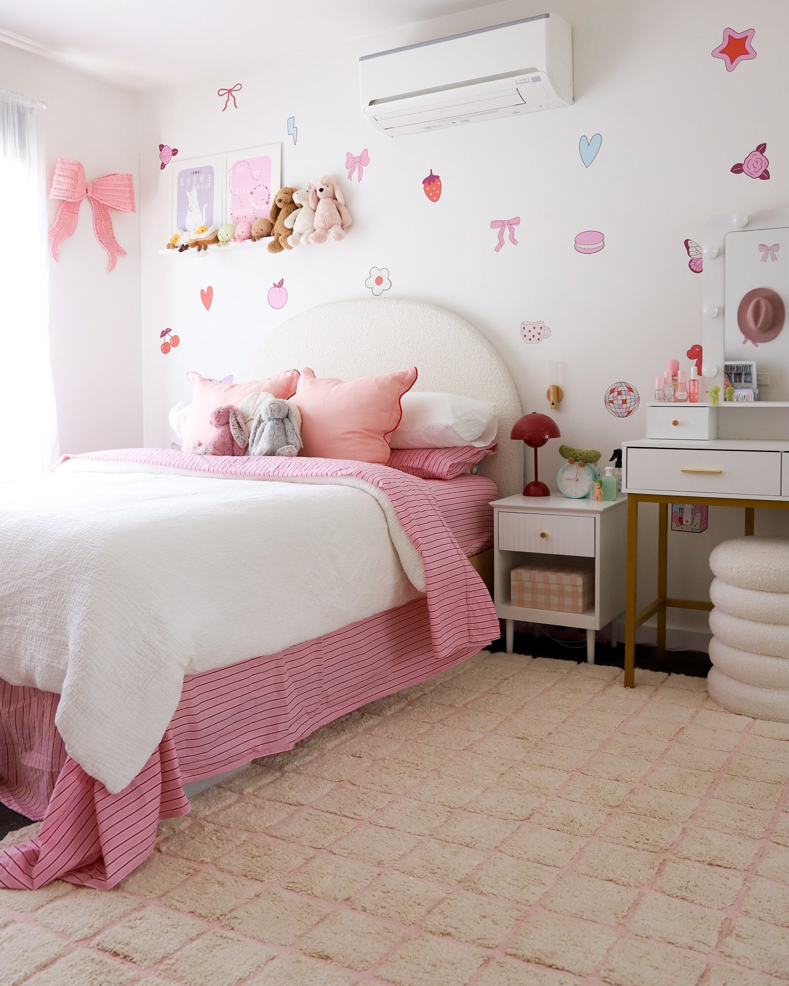
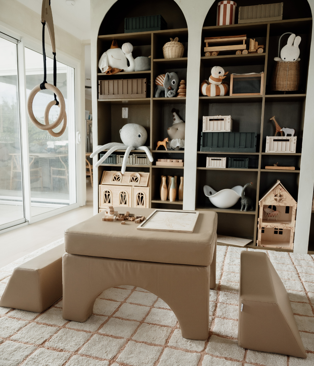
Locally, you can see all of this converging. Adairs now runs a dedicated Polka Dots & Spots edit sitting alongside their Chocolate Hues and Gingham ranges — proof that the pairing above isn't a coincidence, it's a considered merchandising decision. Kmart's spotted bed linen has become one of the more shared bedding styles on social media this season, almost always styled back with warm, brown-toned accessories. Across the wider homewares market, the same dot-and-neutral formula is turning up in cushions, lighting and tableware from multiple retailers, which is usually the clearest sign a print has moved from niche to genuinely mainstream.
The Design Movement Underneath the Dot
If you zoom out, polka dots aren't really the trend. They're the visible symptom of a bigger one: a move toward what's sometimes called warm minimalism, or quiet playfulness — spaces that are still calm and uncluttered, but with just enough personality that they don't feel sterile.
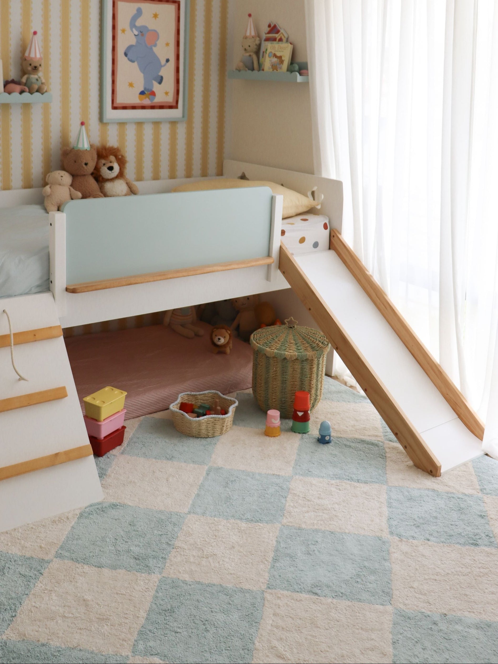
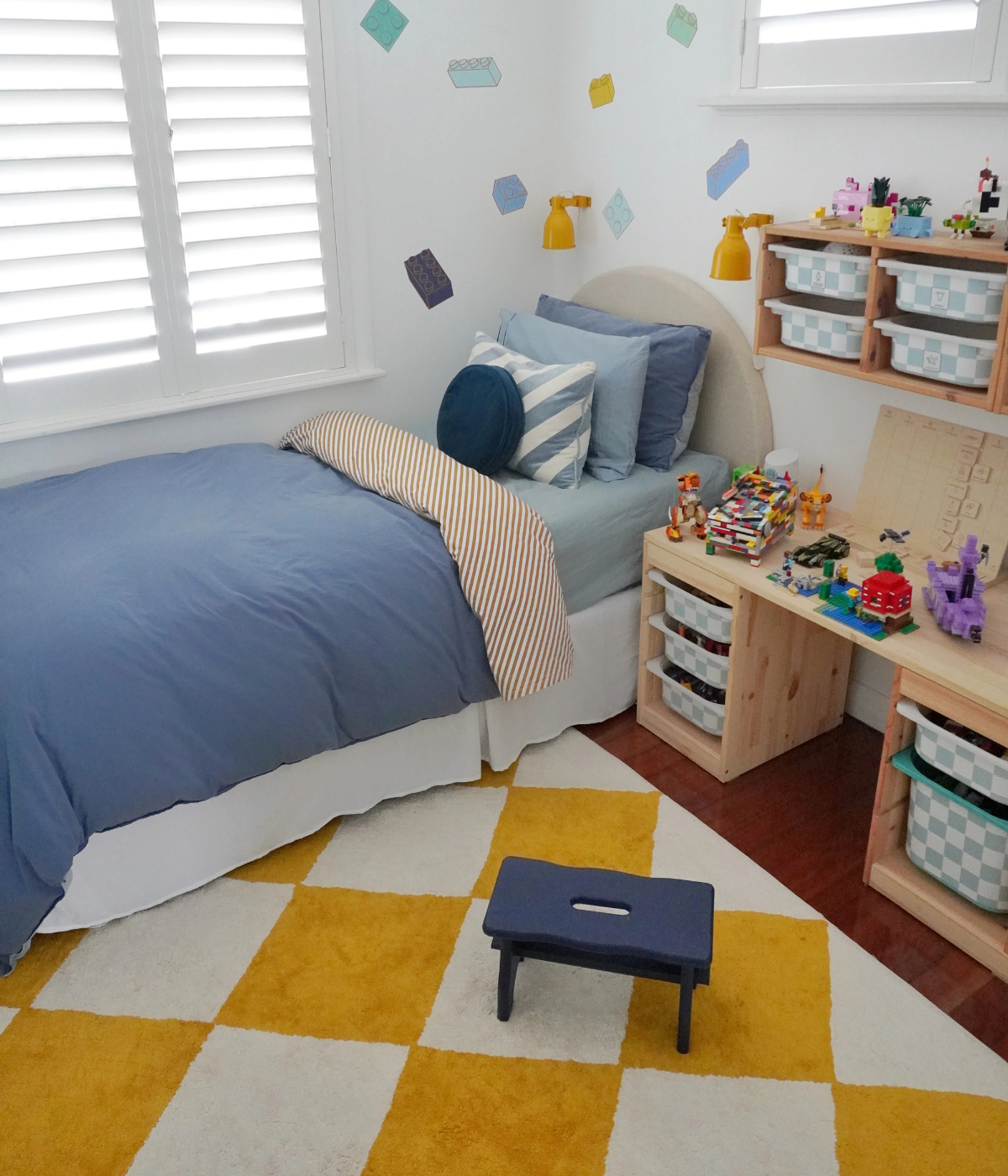
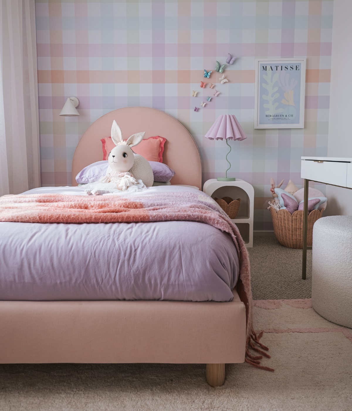
This is the same instinct behind the recent rise of Scandinavian-influenced children's interiors, where a kids' room is treated with the same restraint as the rest of the house — one considered pattern, a neutral base, natural materials — rather than being a separate, louder zone. It's also behind the so-called "grandmillennial" revival in nursery styling: soft, classic, slightly heirloom-feeling design that's built to still look right in five years, not just for the newborn photos.
Polka dots slot neatly into both movements because they're one of the few bold prints that behave like a neutral. The shapes are simple, evenly spaced and endlessly repeatable, so a room built around them reads as calm rather than busy — which is exactly the quality warm minimalism is chasing. It's a genuinely useful thing to understand before you buy anything with a dot on it: the print works because of its restraint, not despite it. Get the scale and colour right, and it does a lot of the styling work for you.
How to Style Polka Dots Without It Feeling Busy
A few things make the difference between a room that feels considered and one that feels like a costume party.
Pick one hero print, and let everything else be plain. The dot should be the pattern in the room — on the rug, the bedding, or one key cushion, not all three at once. Once you've placed it, resist the urge to add another loud print alongside it. Stripes, gingham and check all pair beautifully with a dot, but only ever as a quiet second note, in a tone lifted straight from the dot itself.
Keep the palette to two colours. The most successful polka dot rooms right now are almost always a single dot colour against a neutral base — cream and sage, oat and blush, white and chocolate. The moment you introduce a third competing colour, the print stops feeling deliberate.
Let the scale do the talking. Oversized, widely spaced dots read as sophisticated and architectural. Small, tightly packed dots read as busy and, frankly, more childlike. If you want a polka dot piece that works in a living room as easily as a nursery, look for the larger-scale version.
Layer in texture, not more pattern. This is where a room goes from flat to genuinely styled. Bring in a woven timber piece, a linen throw, a boucle cushion, a worn leather stool. The texture creates depth so the dot doesn't have to carry the whole room's visual interest on its own.
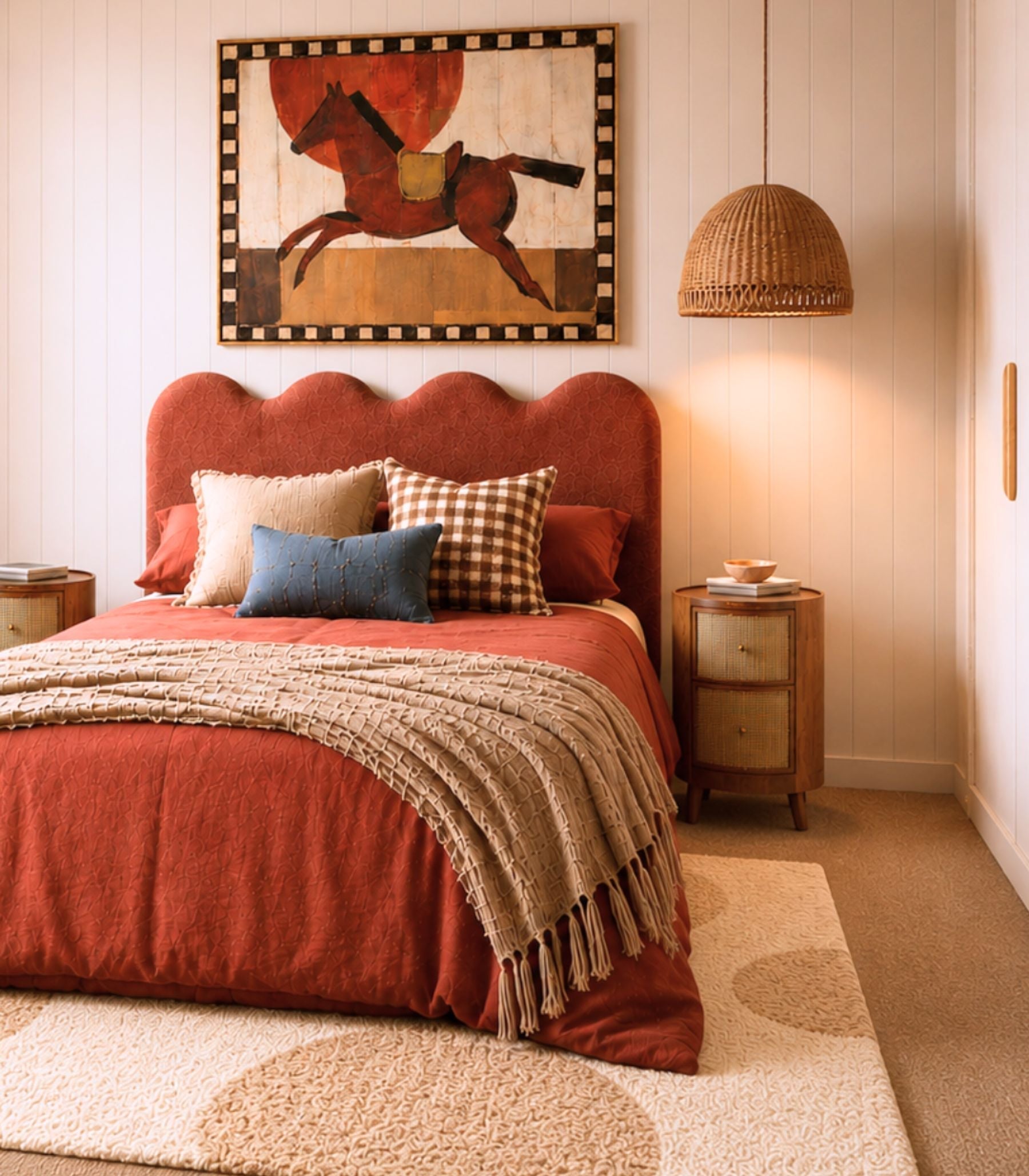
Use chocolate brown as your anchor, not your accent. Given how strongly this pairing is trending, it's worth leaning into deliberately — a chocolate throw, a timber frame, a leather basket. It grounds a playful print instantly and stops a room from tipping into "kids' theme" territory.
Trend Bedding vs. a Rug That Anchors the Room
Here's where it's worth slowing down, because this is the decision that actually matters more than which print you choose.
Bedding is designed to be temporary. It's meant to be refreshed with the seasons, updated for a birthday, swapped when taste shifts or a child outgrows a phase — and that's precisely its appeal. You can chase a print like this in bedding with almost no risk, because you were always going to change it again.
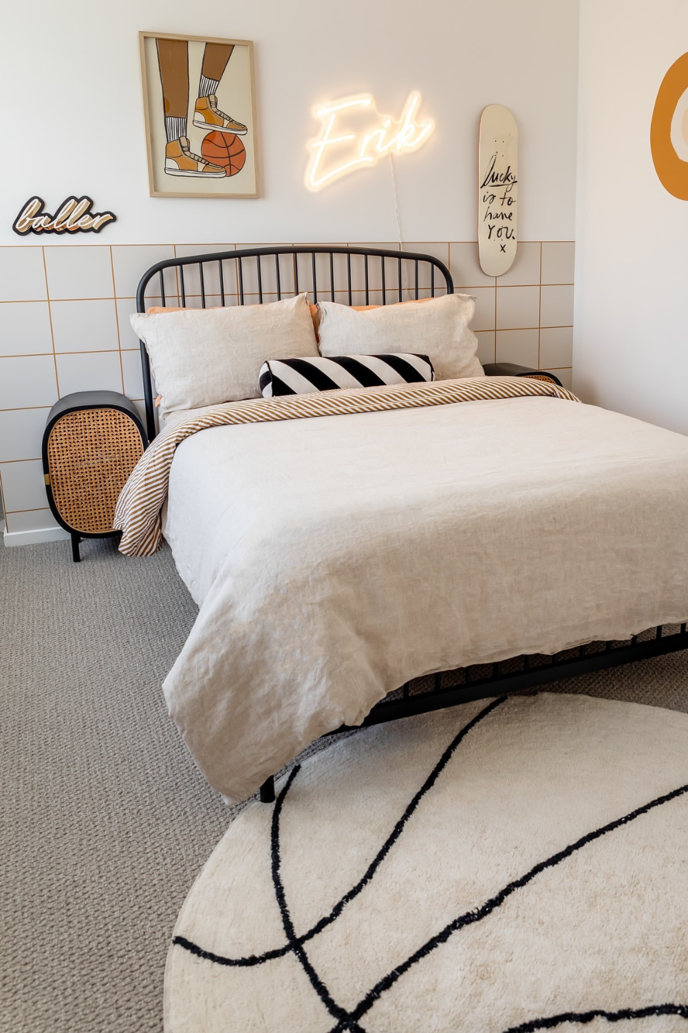
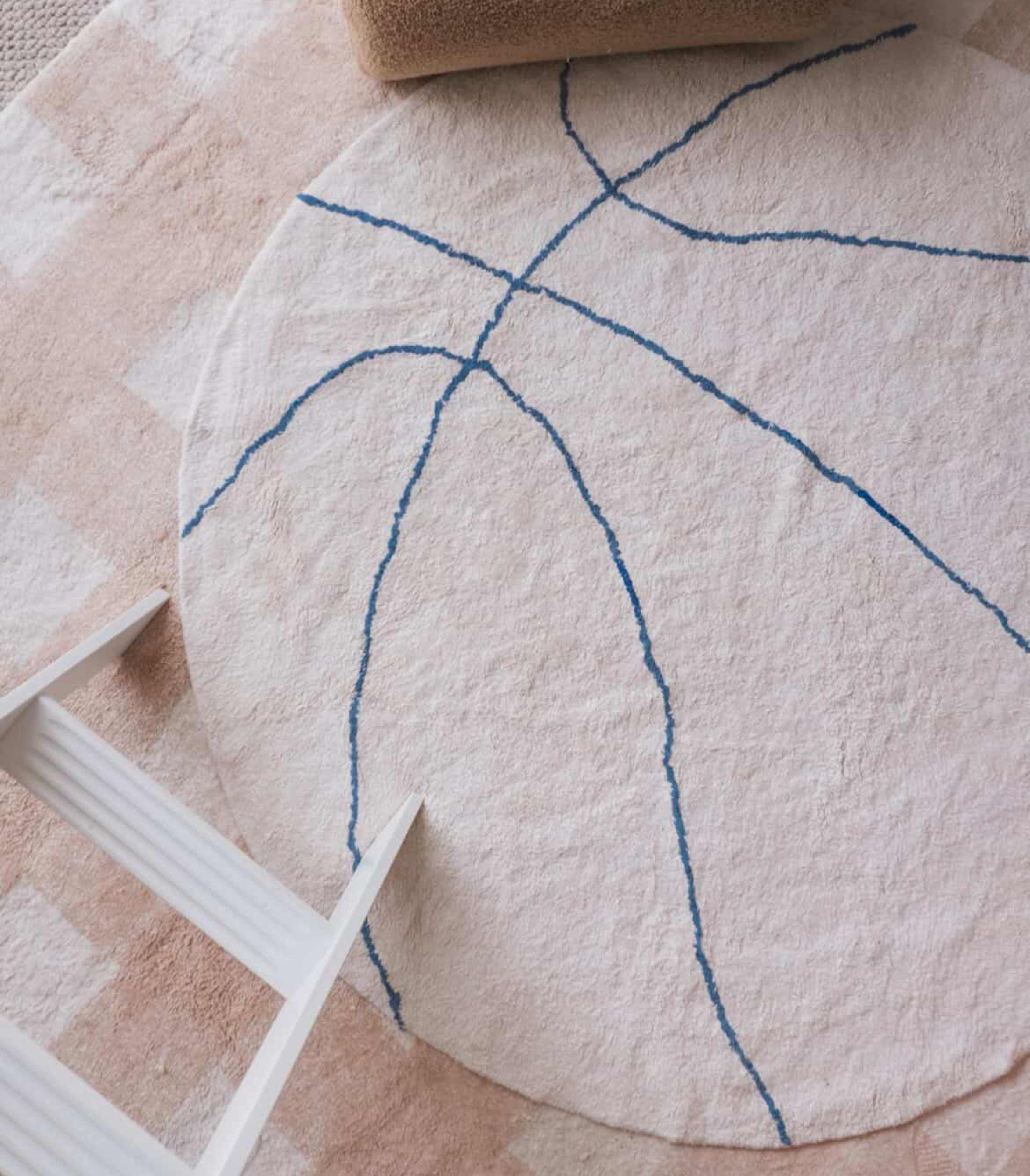
A rug is a different kind of decision. It sits underneath everything else in the room, it's the largest single colour and pattern choice you'll make, and — done well — it's not something you replace every time a trend moves on. Which raises the more useful question: if you're drawn to this print, is bedding really the smartest way to bring it home? Or is there a version of it built to last well past the trend that introduced you to it?
We'd argue for the second option, and not just because we make rugs. Children outgrow bedding faster than almost anything else in a home — the sheets that suited a toddler rarely suit the same child at eight. But they don't outgrow good design at nearly the same rate. A well-chosen rug, in a considered colour and a genuinely timeless pattern, tends to move with a family rather than get replaced by one.
Practically, that looks like this: a rug starts in a nursery, softening the space and setting a colour palette for everything else in the room. As a child grows, it moves into a playroom, standing up to daily traffic and everyday mess. Later, the same rug — because it was never trend-specific to begin with — can sit comfortably in a bedroom, or even a family living room, quietly anchoring a completely different stage of the same home. Bedding rarely makes that journey. A good rug does it as a matter of course.
There's also something a rug does that bedding simply can't: it sets the tone for the whole room, not just one piece of furniture within it. Colour palettes tend to build outward from a rug, not toward it. Get that one decision right, and the rest of a room's styling becomes noticeably easier.
Where Polka Dot Fits In
While we were developing the next chapter of our Signature Collection, one design in particular kept earning its place in the conversation. We're calling it Polka Dot, and it wasn't shortlisted because it was trending — it was shortlisted because it had every quality we look for regardless of what's popular. It's calm rather than busy. It's playful without tipping into childish. It sits as comfortably in a considered living room as it does in a nursery. And because the scale is generous rather than fussy, it does exactly what we described above: it reads as a neutral with personality, not a statement piece you'll tire of.
It comes in four colour ways that follow the same restrained pairing this trend does so well — Sage, Sky Blue, Dusty Coral and Mustard, each set against our signature soft, undyed base. They're the same considered palette we use across the rest of the Signature Collection, which is part of why this rug will still make sense in a room long after the wider trend has moved on.
That's really the distinction worth holding onto here: this isn't our version of the polka dot trend. It's the timeless version of a pattern that happens to be trending right now, which is a very different thing, and exactly why it made the shortlist at all.
Polka Dot hasn't officially launched yet, though. It's one of three new designs alongside Diagonal Stripe and Wave, that we're putting to our community before deciding what earns a permanent place in the Signature Collection. Which is where you come in.
An Invitation, Not Just a Launch
As we keep evolving the Signature Collection, we wanted this next stage to include the people who actually live with these rugs every day. That's the thinking behind our current Design Challenge; an open invitation to help decide what makes it into the range, rather than simply choosing from what's already on the shelf.
Polka Dot is one of three brand new designs we're considering for the Signature Collection, alongside Diagonal Stripe and Wave. None of the three have launched yet. We're asking our community to help us decide which one earns its place.
It's a simple process: download your favourite of the three designs, then style it however you like, a mood board, a Pinterest board, a room concept, even an AI-generated interior. There's no right way to do it. Share your concept on Instagram, tag @hunterandnomad and use #HNDesignChallenge, and it's in the running. Our favourite entries will receive the rug they designed with, ahead of its official launch, and with the support of a few brand partners, some concepts may go on to become real, styled rooms.
If Polka Dot is the design that spoke to you while reading this, this is where you can actually help shape its future in the range.
Leave a comment
All comments are moderated before being published.
This site is protected by hCaptcha and the hCaptcha Privacy Policy and Terms of Service apply.